Batman sixty-seven
May 9th, 2011
A bit battered, spine ripped right off, but still – 44 years of existence, mine for a mere seventy-five pee.
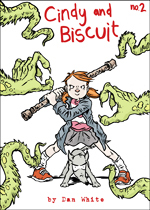
Batman Annual 1967.

It’s all reprint, but the cover looks like original art commissioned in the UK – check the oddly Blyton-esque Robin, a schoolkid larking about like he’s in an infinitely cosy boys comic of the day, or an underage soldier, meat for the melodrama of a WWII book. Check Batman, smiley of face and cheeky of chin, with a prop-forward’s physique.
It’s a traditional olde-tyme British annual from the height of Batmania. While Jiro Kuwata and a team of inspired merch designers were recasting the Pointy-Eared Protector according to the stylistic imperatives of his home, things here were a little more half-arsed and haphazard. Among the Bat-stuff in here are b&w Martian Manhunter backups, and it’s conceivable whoever got the job of doing the cover didn’t know that J’ohnn Jone’z is actually green. How else to explain the amazing of this?:

Here is the Manhunter from Mars in a universe where he got a job as a nineteen-sixties schoolteacher and, immediately pre-breakdown, decided it would be a really good idea to show and tell his class all about his weekend cosplay fetish. How the artist got the idea for the baldy-mullet plus chops hairdo? We will never know.
Indoors it carries on at a similarly eccentric lick. The production on this piece was erratic to say the least – most of the reprint material here is b&w, but some is in full colour, and for some of the strips something very odd (and accidentally rather wonderful) happens to the colouring budget:

These scans are shit obviously, but on the creamy, fuzzy old paper this sickly super-sepia seems to have leaked out from the depths of the stock like yellowy alien blood. The literally jaundiced leer on the baddie’s face in the top-right panel is more perfect for this page than any more deliberate or less operationally hamstrung colourist could hope to achieve. The following panels – yellow Batrocket, yellow Batman (you can tell from the handy II on his chest that he’s actually yellow Batman II, Bruce Jr. or something) – show how the traditional four-colour scheme of superhero comics, serves to hide an impressionistic something revealed when the chromatic process is interrupted or stripped back to its elemental keys. Obviously, you think as this page tips from somewhere simply funny into realms altogether more sublime, all comics should be the colour of morning wee.
It’s somehow easier to remember with older specimens that all comics are autonomous and magical machines of loving grace. It’s likely the fact that they are in a more apparent state of decay, and have been passed through many hands and animated by many eyes, that makes their uncanny qualities bleed into the normal world more readily.
This one knows, somehow, exactly what’s happening in Batman comics forty-four years from now:

The other Batstrip is interesting 1) for featuring Danny the Dummy, a famously crap Batvillain, who gets taken down by a statue of Batman. The statue can’t even be bothered to stand up.

And 2) this, a panel who time is killing very softly indeed, chaotic reality shazaming the purest pop-art majesty into being, right here, in these kids comics, these kitsch and campy bits of tat. Today it appears as though printed on peachskin.

Was even that a good thing? Would the colour money have been better spent on showing the cover artist a picture of a green and bald John Jones? No, it would have been much better to colour this strip instead.

A rare Batman: Space Explorer story with Space Ants and all kinds of shit, rendered in unstunning b&w. (Low tolerance for b&w Silver Age reprints: the colour medium was the message.)
Sorry to end on a downer.


Leave a Reply
You must be logged in to post a comment.