Was There Blood on the Sheets?
February 28th, 2014
(This article was originally posted to Vibrational Match on Saturday 29 August 2009)
The first thing I think of whenever I see the cover for Darwyn Cooke‘s adaptation of Richard Stark’s Parker: The Hunter…

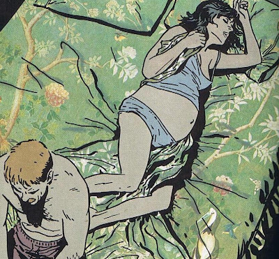
…is this page from Frank Miller, David Mazzuchelli and Richmond Lewis’ Batman – Year One:

The scene is nothing new in itself — you’ve got the lonely noir hero and the inert woman, trapped in the space between domesticity and dark adventure — but the difference in staging makes me think of something Dan Nadel said while he was tearing The Hunter to pieces:
When I think of this work I think of what Mort Meskin would have done, with his vibrant, almost ecstatic brush marks; what Toth might have done with his sense of page design and the figure in space; or what the younger Mazzucchelli might have done with his figures weighted in space and rooted in fully imagined environments. I think of all that and wonder at such a missed opportunity. Those guys used cinematic set-ups, but they never allowed style to overtake content. Krigstein, for example, was a master of adapting filmic rhythms into comics. But at the heart of his experimentalism is a drive for clarity.
Now I enjoyed Parker: The Hunter way more than Nadel, but I can’t deny that he has a point. While I like Darwyn Cooke’s work, I’ve never enjoyed it on anything other than a surface level. When David Fiore panned New Frontier, some people reacted like he was crazy (hi ADD!), but you know what? I think he was on to something!
For me, New Frontier was pretty but boring. The Hunter is more exciting, but it’s still a brutally functional work. Which is fitting, given that the title character is basically revenge machine. Tucker Stone riffed on this in his review of the piece:
Feelings–unpredictable, messy and useless when it comes to control fantasies–wouldn’t it be nice if one could just turn them off when they get in the way? For Parker, the answer resounds as an unequivocal “yes”, and that’s what The Hunter circles around. A man who can do anything, as long as he doesn’t make the mistake of loving a woman ever again. He tried it out. Didn’t fit.
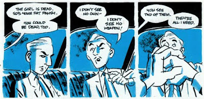
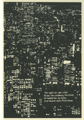
This nicely captures the thrill of reading the book while underlining its essential emptiness. As Stone notes, Parker spends most of the book in action, off-panel and in the shadows. Where Dan Nadel finds the character’s generic blankness disappointing, Stone seems to perceive it as another indication of the character’s brute efficiency, as encapsulated in this image:
All of which makes Parker: The Hunter sound like a Frank Miller story with a veneer of smoothness and sophistication, which seems about right to me.
Since it’s scripted by Frank Miller, Batman – Year One is every bit as obsessed with tough men and tough choices as The Hunter. It’s the art team of David Mazzuchelli and Richmond Lewis who provide the book with its extra luster, and the reasons for this can be found in that picture of Detective Jim Gordon perched on the end of his bed.
Both pictures set up varying levels of reality — on Cooke’s cover you’ve got Parker in the foreground, solid and real, and the dead woman beside him. The two characters seem to exist under spotlights, but while this makes Parker and everything around him seem darker and more defined, the light that bounces off of the corpse’s head whites everything out into nothingness. The page from Batman – Year One establishes a similar dichotomy – you’ve got the bed, with its preposterously textured patterns, and the darkness outside of the bed, in which only tough-guy noir talk can exist.
It’s the otherworldly weirdness of the Year One bed sheet that really takes that image over the edge though:
The situation is cliched, but the Gordon family bed is of another order to anything else in the comic. Sure, there are moments where Richmond Lewis leavens the purply black hues with dazzling hints of yellow and orange, or where one or two dashes of Mazzuchelli’s linework give his characters a battered flexibility that’s unmatched in Cooke or Miller’s work (his Jim Gordon in this image approaches this state without quite reaching it). But seriously, what the hell is going on with that bed pattern?
According to Dave B Cooper in this dusty old Barbelith thread, this effect wasn’t present in the comic when it was originally serialised:
The colouring’s probably a subject of some variation – as Dan says, the subtle colouring’d be lost on newsprint, and indeed there was some recolouring done for the collected version, I believe – I don’t think it was entirely redone, but (for example) the bedsheets at the end of (I think) chapter three (Gordon sitting on the edge of the bed while Barbara sleeps, the gun heavier in his hands etc) was just a solid colour in issue 407 of the comic, but becomes a rather nicely painted patterned set of bedclothes in the book. Not knocking at all, but there were some changes made, IIRC – possibly to play on the upgraded paper stock and production values of the TPB, I guess.
This is amazing to me, and I’d really love to see a scan of the original page since I can’t imagine the page (or, indeed, the comic) without this image as I know it. Which is interesting, because I think that this scene shows Gordon struggling to keep the family bed in mind, and tending away from it, towards the harsh action his story demands from him:
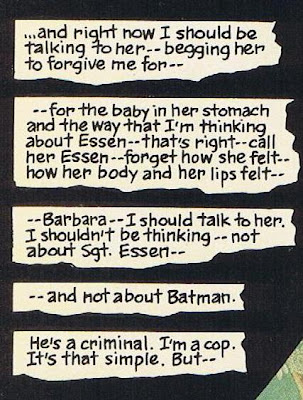
But — maybe he should have paid more attention to the bed he was sitting on, in the collected edition at least…
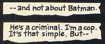
But — this page, like the comic it exists in, isn’t built that way. The narration tips towards the bed and then slides right back off it again, returning to the hard black that makes up the rest of the page, just as Gordon’s mind slips back into the noir stuff, the dark stuff, the words themselves becoming less important than their direction:

But — still, for a moment that’s either long or short depending on how long you spend looking at that page, that image, Mazzucchelli and Lewis open up the possibility of other stories happening in Gotham. The Gordons’ bed is strange enough to survive and to generate its own narratives without the help of Batman or his enemies and derivatives.
But — truthfully, I’m not sure how much of this work is done by Lewis and how much of it is done by Mazzuchelli. The shifting haze of greens is Lewis’ work, and the body language of the two main characters is Mazzuchelli, but who’s responsible for the patterns on the bed? I’ll take a guess that it’s Lewis and let a more technically astute commentator correct me, but even if that’s the case I wouldn’t downplay Mazzuchelli’s contribution. Just look at the way the covers twist through Barbara Gordon’s legs and back under her arm an over her chest:
She’s not just a part of the scenery, but she is tangled up in these patterns, rather than the ones that her husband is currently debating as he sits on the edge of the bed.
But — you might fairly object that I’ve just spent a thousand-odd words comparing a piece of sequential storytelling, a mix of words and text, to an image that was intended to work as a cover and nothing else. And you’d be right, but only up to a point. Because there aren’t any pages in Parker: The Hunter that I would want to write about to this extent, while there are many panels and pages in Batman – Year One that point me in this direction. And I like that Darywn Cooke cover, as much as I like anything in the book — it expresses everything it needs to express via starkly defined iconography, and I enjoy that, but I enjoy what Mazzucchelli and Lewis do with Frank Miller’s work more.
But — it would probably be fair to say that I’m just re-writing my Panel Madness essay on Criminal here, and what can I say, I’ve got a thing for these sort of moments. I like to get caught up in the crushing gravity of a good crime story, but I also like to get hints that this gravity might not be as indisputable as it initially seems. Speaking of that old Panel Madness piece, let’s compare Sean Phillips’ lively city streets…

With Cooke’s equivalent:
But — again, you might say that this is an unfair comparison, or that we’re looking at two different types of intent here. Which we are, but that’s exactly my point — the image from The Hunter serves to break up the narrative, while that Criminal panel does the same thing while also suggesting a variety of other narratives, stories that we’ll never get to see. The page from Batman – Year One has the same sense of added life to it, and it’s this life that Mazzucchelli has taken to exploring on the page since he abandoned the world of corporate comics.

Still, much as I love the mature Mazzuchelli – I’ve even come around on Asterios Polyp recently! – there’s something to be said for the strange thrill involved in finding a page like this in a macho adventure comic. Maybe it replicates the excitement of hearing a pleasantly discordant note in a piece of music, or maybe it’s got something to do with stumbling into a moment that seems ripe with forgotten possibilities. Maybe it’s got nothing to do with anything! I don’t know, the only thing I’m sure of is that it’s moments like this/images like this/stories like this that keep me reading, watching, looking, listening. Ridiculous as it might seem, I might even go so far as to say that it’s unexpected pleasures like this that keep me living, and as long as I keep finding these feelings I know I’ll never want to stop.
But — there’s always another page to turn, isn’t there? And who knows what that’s going to lead to: new richness or mechanical precision or both or neither? Only one way to find out — stop talking — stop narrating — stop rationalising. Just flip forward — to here knows when!


Leave a Reply
You must be logged in to post a comment.